At this year's IO Google introduced a new layout - the ConstraintLayout - and also presented it's totally revamped layout editor. I am not going into how to use the layout. Google itself has done a good job in explaining it with its code lab "Using ConstraintLayout to design your views".
In this post I am going to highlight what I like about the new layout and the new editor.
What's to like about the new ConstraintLayout
With the new layout there's a lot to like. Here are my favorite things about it:
- The aim to help us developers
- The availability of the stretched width/height of its children
- The use of guidelines
- The fact that is doesn't feel as weird as Auto Layout
Now let me dig a bit more into each of these.
The aim to help us developers
At this years Google IO talk "Android Layouts: a new world" Nicolas Roard and John Hoford gave two reasons for introducing a new layout:
- To make handling complex screen designs easier
- To improve the performance of complex layouts
And both are, of course, highly appreciated.
If you have a complex layout, things can get pretty difficult to manage. Moving stuff around in a RelativeLayout is bound to break a lot of other stuff. That's what they cited at IO. And it is true. So if this new layout help us with this, I'm all for it.
On the other hand things are currently not as bad, as they made them out to be. And the nesting can actually help you understand certain parts of the layout better since they are grouped and broken down into smaller parts. More practice with the new layout will show, if this really makes that much of a difference when maintaining screens.
In my opinion more important is the second motivation: To improve the performance. As users we all want the apps on our devices to run as smoothly as possible. And as developers we want to deliver this experience to our users. Thus, I'm all for it.
When it comes to performance improvements there is never any limit for additional improvements. So if Google helps us, I'm more than happy. Maybe this way the ConstraintLayout also reduces the need for some custom views or layouts.
A bit down I'm going to have a look at the actual performance of the ConstraintLayout as it is today. It definitely needs more work. But the goal is laudable and the final implementation surely will fare much better than the current one. Mind you, we are talking about an alpha version here!
The availability of the stretched width/height of its children
The new stretched (or "any size") appearance is better than match_parent in the context of this new layout. By stretching to it's constraints this new mode is not limited to the enclosing container but can be used for arbitrary areas of the screen. You could achieve this with other means before - but now we have a unified concept for everything, which sounds more logical to me. It's not that big a change, but a nice one nonetheless.
Guidelines are great additions
In addition to the layout and the editor we also have guidelines. These only make sense in the context of the ConstraintLayout - but they are actually proper views. They show up as separate view items in the hierarchy and get rendered at runtime.
But fear not. The decompiled Guildeline class is not only a mere 44 lines short - it also is as simple as a view can get. It doesn't draw anything, always sets the dimension to zero width and zero height in its onMeasure() method and on top of that sets itself to View.GONE in the constructors. So no problems here.
What this means is, that the guidelines can work as any other view, when it comes to constraints.
For the placement of the guidelines you can use fixed values (say always 100 dp from the left edge) or percent values (say always at 33% of the whole screen width).
Later on in this post I am going to show you a sample for how to make good use of guidelines.
Not as weird as Auto Layout
When I first heard about the new layout during the IO keynote, my first thought was: "Oh no! Auto Layout is coming". I have not done much with iOS, but what I have seen of Auto Layout, well, let's put it this way: I do not necessarily like it. It breaks to easily whenever you try to do something with the screen. It's only partially intuitive. In short it's nothing you like to work with.
Right now I do not have these negative thoughts when it comes to ConstraintLayout. Maybe Google learned something from what Apple did wrong. But it could as well be, that it's just because ConstraintLayout is not (yet?) as powerful as Auto Layout. I don't know - all I can say is, that ConstraintLayout seems to behave quite reasonably. But seasoned iOS devs might think about this issue very differently 🙂
What's to like about the new editor?
The new editor of course is also part of Google's plans to make life for us developers easier. Actually it might end up to be also quite useful for sketching and prototyping. Who knows.
I especially like these things:
- The properties pane has improved a lot
- The editor shows lint warnings and errors prominently
- The editor supports all kind of
ViewGroups- not onlyConstraintLayout - Everything is still XML backed
- The screen is easily resizeable
- The editor lets you select an image for all
ImageViewsright away
The improved properties pane
Do you remember the old properties pane? All kind of attributes were listed in an alphabetical way. Only very few more important properties were at the top:
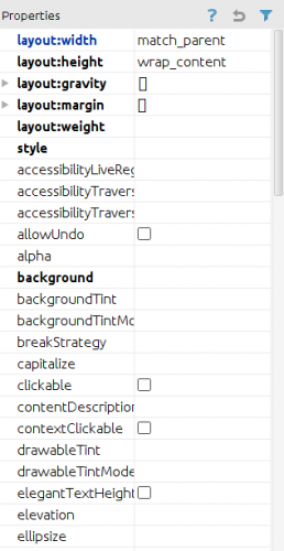
Now this has changed significantly - and it is much more usable that way:
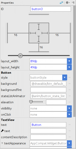
Android Studio by default lists only important and often used properties in this pane. Though, if you feel like it, you can always go back to the old list by clicking on the "Show expert properties" button on the top right.
Some attributes probably should be added (like layout_weight for LinearLayout children or layout_gravity), but all in all this is much better than before.
Also note that for views that extend other views the properties pane lists the properties grouped by the class they originate from. In this case first those of Button and afterwards those of the inherited TextView.
The error hints
Another nice addition we haven't had before is the prominent display of lint errors and warnings in glaring red, so that you can't miss them:

And if you click on the number, it expands to show the problems:
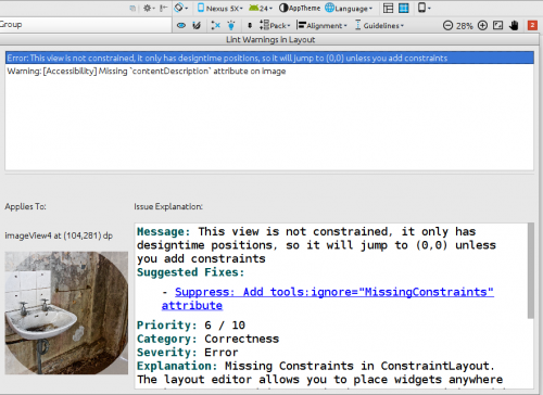
And as you can see, it also shows the content of the view in question, so that you know right away which view has a problem. Nice!
The new editor supports all kind of ViewGroups
When Google introduced the new layout editor it only showed it with the ConstraintLayout. But you will be able to use it for all existing layouts as well. For Linearlayout this works well, for RelativeLayout not so much. For RelativeLayout some magic of the ConstraintLayout like dragging to which other view the new view should be relative to would make sense as well.
I guess Google puts more emphasis on correctly supporting ConstraintLayout than supporting the other layouts like RelativeLayout. Actually: I hope so. I very rarely used the designer with those older layouts. I preferred the XML view and expect this to remain unchanged for those. And for those "legacy" ViewGroup types I wouldn't mind if it stayed like that. After all the idea is to get rid of them anyway.
Everything is still XML backed
Obviously the aim of Google is for us to use the layout editor instead of the XML editor in the future. So why then is XML still a big deal?
In my opinion there are a few reasons:
- XML is better to fix fiddly things
Sometimes working with a graphical editor has its drawbacks and it can become pretty difficult to access the correct handle and drag it onto the correct drop target. Or you made a mistake and marked some views as invisible or gone - or made them ridiculously small. - XML is ideal for version control
With a simple diff you can quickly see what changed over time. This is nice for yourself (using your local history or comparing changes to previous versions). But is even more important when collaborating with other. Code reviews and reasoning and discussing about pull requests is so much easier with XML and line numbers than having to throw screenshots around or having to run stuff just to understand even the simplest changes.
Easy resizability of screen
At the bottom right corner of the screen you have this handle. Nearly too unobstrusive:

You can use this handle to drag and resize the current preview screen and see which influence this has on your layout. Probably not often needed, but it can come in handy - while creating your layout, but also during presentations and trainings.
The editor lets you select an image for all ImageViews right away
Whenever you drag an ImageView or ImageButton onto the layout, the editor pops open a dialog in which you can choose the image to show or the color to use. That might not save that much work, but it's still a nice detail, that I appreciate:
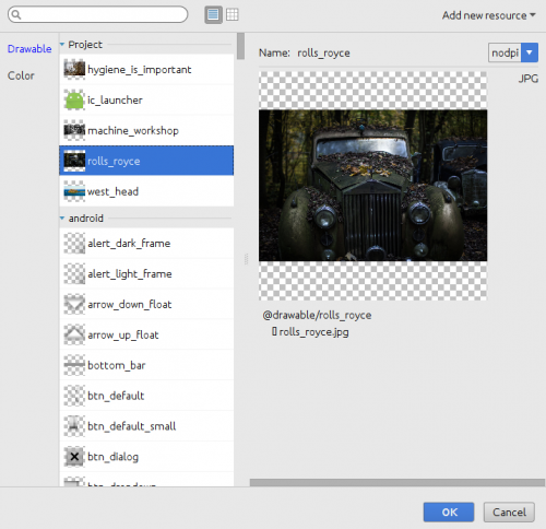
Note that this screen also shows the more likely ones (the images of your project) at the top.
What about Performance?
Since performance improvements are among the main reasons to create this new layout, I did some performance tests to check if this goal is met.
I compared a layout used within a RecyclerView. Nothing too fancy, just some nested LinearLayout and RelativeLayout containers. I moved this layout manually over to ConstraintLayout and did some rather sloppy performance tests.
Comparing those two on an emulator as well as on an Nexus 5 yielded overall a performance penalty when using the new ConstraintLayout.
Performing worst is the measurement. The onMeasure() method takes roughly ten times as long as the one of the LinearLayout I used for comparison. And it uses up the bulk of the time with taking about 60 times as long as onLayout(). Thus the 30 per cent hit of the onLayout() method of ConstraintLayout compared to the one of the LinearLayout in question is nearly irrelevant. Finally layout inflation also took longer with ConstraintLayout than with LinearLayout.
The ConstraintLayout does lots of calculations to find out where and how to display each of its children. Internally (at least) three rather lengthy classes are working together to get the results: LinearSystem, ConstraintWidget and ConstraintWidgetContainer. To fully understand the performance behaviour I would have to dig into the depth of these classes (and for this I prefer the commented classes when their sources are released by Google). But just by having a cursory look at the decompiled code it looks like those classes have to do a lot.
Right now it looks like the performance improvements that Google hopes to achieve are far off. But at the Google IO talk John and Nicolas mentioned that they are working hard on improving the performance. So we can expect this to get better over time. And since the ConstraintLayout comes as a separate library, further improvements are likely even after the final release. If the result will be good enough in the end - well, that remains to be seen. We have to wait for future releases. And we have to do some more (and more thorough) testing with multiple layouts. Right now I'm more than willing to give Google the benefit of the doubt.
Additional note (as of July, 9th): This post was written based on the third alpha of ConstraintLayout. In the meantime a fourth has been released. Which, according to Nicolas Rouard, should be performing much better. I will give it a try and let you know about improvements in future posts. As I've written above: Google is hard at work on improving performance - and even this fourth release is still an alpha release!
Additional note (as of July, 22th): I have used the same layout for testing the fourth alpha build. It is indeed much better - but still needs improvements. With the performance imporvements of this build, onLayout() takes roughly a third of the time it took before. And onMeasure() now roughly twice as fast as before.
In one thread on twitter, Nicolas Rouard mentioned that - performancewise - ConstraintLayout is best for complex layouts for which you would have needed deeply nested layouts before. Keep this in mind, when deciding what layout to use. If time allows, I will try to find a suitable deeply nested layout to verify this in future add-ons to this post.
Some annoyances
Not all is working perfectly at the moment, though. Right now these things bother me the most:
- There's a noticeable lag between blueprint changes and design preview changes
- The preview is not always correct
- The blueprint view doesn't heed text layout constraints
- Constraints do not always work as expected
- Undo works very unreliably
- The editor undos stuff or changes stuff in unexpected ways
Noticable lag between blueprint changes and design preview changes
On bigger screens it's quite useful to open the blueprint view and the preview next to each other. But especially if you use lots of stretched views or many views that make use of the bias you will notice a growing lag in the preview.
This has already improved a bit with the latest updates, but is still noticeable and sometimes a bit irritating. Also while calculating those new positions the editor makes heavy use of your CPU. Luckily only for short bursts.
Preview is not always correct
When you miss some constraints, the preview view shows an incorrect screen. This actually is by design and has been different in the very first version of the layout editor. Back then (due to the aforementioned lag) things jumped around seemingly haphazardly, which of course was very disturbing. But apart from the lag the other reason for this was, that you can use the preview to drag things around. Which I strongly advocate against (see below). There's no reason for that. We have the blueprint editor to edit constraints. Let the preview do what its name implies.
Blueprint view doesn't heed text layout constraints
This is a fairly minor issue - yet one I would like to see corrected. In a TextView setting the gravity doesn't change the location of the text in the blueprint view. The setting is reflected correctly in the design preview, but when working with the blueprint only, it feels odd that changing this setting doesn't have any effect. Switching between the design and blueprint view just to verify that this setting did indeed work as expected is a bit cumbersome. Nothing that makes life really hard, but something that requires an extra step and makes one wonder at first.
Constraints do not always work as expected
The following screenshot admittedly show a very weird and pretty useless screen - but it shows that constraints might not work as you would expect them to work:
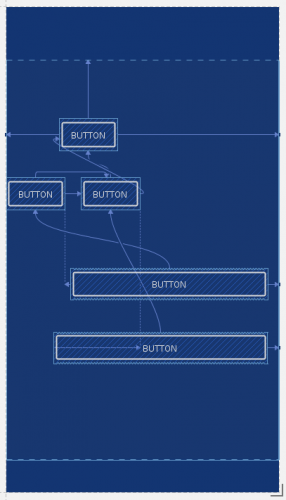
Never mind that this screen is among the weirdest app screen you might ever stumble upon. It still should be correct 🙂
As you can see the bottom button is left aligned to the right button in the second row. That's at least how the button should be. And you can also see, that this button is stretched. So why then does it stretch that far to the left? What makes this calculation go that wrong? My guess is, that the problem is not so much with the button at the bottom, but the buttons of the second row.
What worries me is not that this specific screen isn't working. The problem is, that I do not know why it's not working and what makes views appear so wrongly aligned. As long as things like this can happen, you are bound to run into this problem with a real screen on a real device eventually. And then it is really bothersome.
Undo works very unreliably
On one screen I accidentally moved one view around after I set some button's visibility to gone and to visible again. I hit Ctrl-Z and the button's visibility changes to gone again. What I had expected, of course, was to undo the last step - which was the accidental dragging of another view.
Trying to reproduce exactly these steps for this post I was not only not able to reproduce this particular problem. Instead I was now not able to undo the moving around step. Alas, very unpredictable again.
One of the earlier versions also behaved differently when using Undo via the menu or hitting Ctrl-Z. This appears to be fixed in the current version. But since Undo is so unreliable in general I do not know for sure.
I think this is the worst problems the editor has right now. When working graphically to quickly test stuff, moving items around should be easily - and reliably - reversible. Otherwise this editor hampers experimentation and is not useful for quickly sketching and for trying things out.
The editor undos or changes stuff in unexpected ways
This is even harder to describe properly since this seems to be even more haphazard than the undo issues. I do not have many proper examples.
On the screen I have worked with while checking and re-checking some stuff for this post I had a button. I changed the visibility to gone, then to invisible and then to visible. Afterwards the view was still drawn as if it were invisible. Reproducible: Of course not 🙁
The editor also tends to ignore size changes (or to revert them when switching between the the XML and then back to the design tab). But nothing of this is easy to pin down and reproducing these issues is unreliable as well 🙂 I do not envy the Googlers having to fix these type of arbitrary issues. And I am sorry for not being able to be more specific. But whoever uses the editor will stumble upon the undo and unreliability issues pretty quickly.
Suggestions for additions
Currently I have two suggestions for the layout and three for the editor:
- Add width constraints based on other views
Add an aspect-ratio constraint- Add Ctrl-Mousewheel scrolling to the layout editor
- Allow changes in the blueprint view only
- Make the guideline's orientation indicator select the guideline
Of course there might be more suggestions in the future when I'm actually going to use ConstraintLayout for productive projects. But right now I think those additions would help a lot.
Now let me tell a bit about why I would like to see those items realized.
Add width and height constraints based on other views
For some screens I would like to ensure that neighbouring elements use the same width (or height) - but not a fixed width. For example you want buttons to divide up all of the width available. Or two images next to each other.
With LinearLayout you would simply set the layout's width to match_parent and then use layout_width="0" and layout_weight="1" on its children and they would divide up the available space.
When I first experimented with ConstraintLayout I thought, that would be easy. Simply use three buttons next to each other, align each of the right ones to the one left of it and finally the left button to the left edge of the screen and the right one to the right edge of the screen. And then make all of them stretch. But this didn't work as expected:
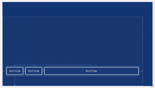
What you see here is that the first two are as they would be with a width of wrap_content and only the last one is actually stretched. In a bug report I filed, a Googler remarked that this works as designed. Stretch doesn't divide up the remaining space between all stretching views. Keep this in mind!
But not all is lost: The team plans to add some constraints that would allow us to do this in the future. Meaning after the first release of ConstraintLayout. The bad part is, that we do not have this right away. The good part is, that they have much more plans for this layout and that we can expect it to get better over time.
Guidelines to the rescue
But even with the first release not having width constraints, we might be able to achieve this, depending on the specific layout at hand.
For the layout shown above the solution is to use Guildeline objects to divide up the space and then align the buttons to it. Here's what the workaround looks like (click on the image to see its original size):
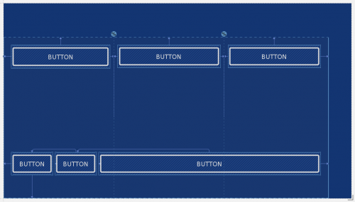
And since sometimes code is easier to understand, you can find the code for this layout in this gist. The gist contains the correctly sized buttons as well as the first attempt without guidelines.
Add an aspect-ratio constraint
Romain Guy pointed out in the comments that the ConstraintLayout indeed has this feature. I'm going to add some more information about how to use it soon. Stay tuned!
Even though I never published it, I once made a board game. For things like this it would be nice to have the ability to ensure that this view always has the same height as it's width. And I can also imagine other use cases where elements should use a certain height depending on the device width. Say half the height as the view's width.
You can achieve this with custom views (and in the case of game boards that's the most logical thing to use anyway), but I still guess this addition could make a lot of sense. Especially for ImageView objects.
Whatever one might think of Auto Layout, there's a reason Apple provides it there.
Make the guideline's orientation indicator select the guideline
If you add guidelines they get an indicator at the top (or on the left for horizontal guidelines) which show whether a guideline is positioned at a fixed margin or at a percentage of the total width. Here's the indicator for a percentage:
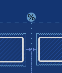
It would feel more natural if I could select the guideline by clicking on this indicator. Right now I first have to select the guideline by clicking somewhere on the line itself. Afterwards I can use the indicator to drag the guideline around or to change the type of indicator. Why not directly so?
Add Ctrl + Mouse Wheel scrolling to the layout editor
The layout editor can get very crowded - depending on the amount of views, how close they are and how they are constrained. In some cases it would be convenient to quickly zoom into the screen, do some designing, and then quickly zoom out again. It also would be really helpful while presenting about the editor and the ConstraintLayout 🙂
This is what we're used to when using graphics software. And Android Studio has a setting to allow this way of zooming for text:

Thus I would like to see, the zooming to work for the layout editor whenever this setting is checked in Android Studio.
Allow changes to be made in the blueprint view only
Currently it's possible to change layout settings in the blueprint view - but also in the preview view. I think the latter should not be possible at all. Restrict designing to the blueprint. If you do so, the preview would be less cluttered - and also might perform better.
The most important reason in my opinion though is, that we are then free to actually use the preview as it should be: A realistic preview. I have already mentioned that the preview is not correct in all cases. And this has to do with the fact that you should be able to drag views around there as well. But if we drop the need for this, we actually can see problems like missing constraints right away.
What about LinearConstraintLayout and TableConstraintLayout
I just had a cursory look at both. Thus I do not have an opinion on them. Maybe in some later post. Depends on how they turn out.
One thing is worth mentioning, though: Those two layouts exist, but Google doesn't explain them at all. I think they didn't even mention them during their IO talk. So that's the one thing I can say: Please let us know what you intend to do with these ConstraintLayout children and what they should be useful for. I actually have a hard time seeing much use of LinearConstraintLayout for example - but hopefully Google proves me wrong.
Does Anko support ConstraintLayout?
For those that use Kotlin and like to use Anko as an alternative to XML, the answer right now is: No! Anko doesn't support ConstraintLayout.
Yan Zhulanow opened issue #210 within the Anko project to add support for ConstraintLayout to Anko. Right now, no further comments have been added. But most likely this will be fixed soon.
To sum things up
The new layout and the new layout editor both show promise. They are currently in alpha (the layout) or preview (the editor), so we can expect to see many - if not all - of the problems ironed out until the final release of both of them.
It's definitely worth getting yourself accustomed with the new layout. I'm quite confident that it is the future.
Having said that, I currently don't use the ConstraintLayout for real projects. But I expect to be able to do so pretty soon.
Please note that everything I have written here is based on what I currently think about the ConstraintLayout and the design editor. There have been lots of improvements during the last iterations of both the ConstraintLayout and the editor and I expect this to go on.
Also keep in mind, that we are only starting to understand the possibilities of ConstraintLayout! The more we use it the more we will know how to do stuff. I'm actually quite excited about it - despite some of the problems the alpha still has.
I very much appreciate what the Googlers are doing there! Keep up the good work - and thanks!
ConstraintLayout at their Google IO Extended Extended. Many of the thoughts in here are the result of my preparations for the talk and feedback about the demo afterwards.
If you're not doing so already, I thoroughly recommend to go to the meetups and devfests of your local Google Developer Group. Here's a map of Google Developer Groups worldwide, if you're not sure where the next one is.
BTW: My local chapter is Düsseldorf. We are nice folks, enjoy pizza and are always on the lookout for good talks. See these shots of a typical meetup.